Welcome to the world of accessible design! In today's digital landscape, ensuring that your website is user-friendly for everyone is paramount.
Accessibility is a key component of UX design, as it allows your website even more accessible by more people.
Taking into account the Web Content Accessibility Guidelines, whilst embracing a Universal Design approach, we'll explore how you can make your digital presence inclusive for all.
This blog covers:
What is Accessibility and Accessibility without Disability?
The term 'accessibility' and the blurring nature of information technologies has made it difficult to differentiate between accessibility for people with disabilities, and usability concerns for the general public. Accessibility is a UX designer's core objective, and can refer to the ease of using a website or application, the ability for people with disabilities to interact with technology, or simply an interface that makes information easy to find.
Whilst a user with a disability may require different features or functionality than the general public, such as assistive technologies and customisable interfaces, the idea behind accessibility is that information technology should be usable by as many people as possible. In this sense, accessibility is closely related to usability—how well can someone use it?
In the absence of accessible features, the internet and related technologies can be profoundly inaccessible and thus create or perpetuate exclusions. Therefore, when considering accessibility and inclusion in web and digital design, one must also address usability, disability, difference, accommodation and preference so that one or some disabilities aren't casted as more important or worthy of accommodation than others.
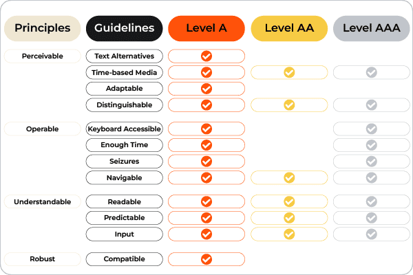
The Web Content Accessibility Guidelines describe that "content is accessible when it may be used by someone with a disability" and is more useful when thinking about the relationships between people, technologies and design. These guidelines include:
- Short equivalents for images, including icons, buttons, and graphics.
- Descriptions of data represented on charts, diagrams, and illustrations.
- Brief descriptions of non-text content such as audio and video files.
- Labels for form controls, input, and other user interface components.
- Create content that can be presented in different ways and is adaptable or compatible with a range of devices and screen sizes.
Web developers Wendy Chisholm and Matt May adopt a perspective in Universal Design for Web Applications, where they write that the ultimate goal of Universal Design is to provide the greatest benefit to the greatest number of people possible, because more people are seeking flexible access to information.
What is Inclusive Design?
Whilst Accessibility is an attribute, Inclusive Design is a method.
It is an approach that enables and draws on the full range of human diversity and perspectives. Designing inclusively does not mean you're making something for everyone, you are designing a diverse set of ways for people to participate in an experience with a sense of belonging, purpose and ease.
Approximately 20% of Australians have a disability, many people are unable to participate physically and/or digitally in aspects of society, so understanding why, and how people are excluded, gives us insights to take action for inclusive design.
Additionally, inclusive design can help improve your brand and position it as a market leader.
- Inclusive design is the process of designing products, services, environments and technologies that are accessible to people with a range of abilities.
- It enables everyone to participate in society on an equal footing.
- Inclusive design requires us to look beyond the physical environment, as well as at how technology can be used by people with a variety of abilities.
- Inclusive design is about making sure that everyone has equal access to information and experiences.
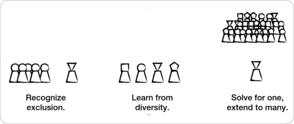
Principles of Inclusive Design
- Recognise Exclusion: Exclusion happens when we solve problems using our own biases.
- Learn from human diversity: Human beings are the real experts in adapting to diversity.
- Solve for one, extend to many: Focus on what is universally important to all humans.
What is Universal Design?
Universal Design is intended to support and assist everyone with special needs including age, location, pregnancy, temporary illness or injury in order to address common barriers to participation. It is about creating products and services that can be used by the maximum number of people possible, without the need for specialised design or adaptation.
The largest challenge is that we often don’t know what those needs will be. We can’t predict how our designs will be used and by whom. This is why Universal Design is about providing flexibility in design, rather than “fixing” an existing problem. It involves thinking about how things can be used differently in different situations or environments, rather than assuming everyone will use them just as they were designed.
Things to consider for Universal Design:
Equitable use
The design is useful and marketable to people with diverse abilities. A website that is designed so that it is accessible to everyone, including people who are blind, employs this principle.Flexibility in use.
The design accommodates a wide range of individual preferences and abilities. A video that allows a visitor to choose to read or listen to a description of the contents employs this principle.Simple and intuitive.
Use of the design is easy to understand, regardless of the user's experience, knowledge, language skills, or current concentration level. A website’s menu with control buttons that are clear and intuitive employs this principle.Perceptible information.
The design communicates necessary information effectively to the user, regardless of ambient conditions or the user's sensory abilities. Video captioning employs this principle.Tolerance for error.
The design minimises hazards and the adverse consequences of accidental or unintended actions. An educational software program that provides guidance when the user makes an inappropriate selection employs this principle.Low physical effort.
The design can be used efficiently and comfortably, and with a minimum of fatigue. Design components that snap automatically to margins, other objects or rulers employs this principle.Size and space for approach and use.
The design provides appropriate size and space for approach, reach, manipulation, and use, regardless of the user's body size, posture, or mobility. A piece of text with adjustable font size employs this principle.
How do we implement Inclusive Design at Resolution Digital?
- Provide a comparable experience so that every user can accomplish a task in a way that suits their needs without undermining the quality or content. You can do this by providing alternative text features like transcripts or audio descriptions, designing ergonomically using colour codes and synchronised text with visuals, and utilising notifications that allow proactive discovery of information.
- Consider that people use your interface in different situations, so make sure it delivers valuable experiences to people regardless of their time, knowledge, skills, abilities or location. You can do this by utilising effective colour contrast for indoor and outdoor environments, context-sensitive help to ease interactions, and captions on smaller devices.
- Be consistent in your use of conventions and make them familiar to your audience. You can do this by using consistent design to build familiarity and understanding, maintaining an editorial style with headings and labels, and using page information architecture templates to help people quickly scan and navigate key content.
- Give the user control by allowing them to access and interact with content in their preferred ways. Examples might include giving users the option to choose between infinite or fixed scrolling, allowing for pinch zooming on touch devices, and putting playback controls in the user’s hands by providing easy ways to stop or close animations and graphics.
- Offer different choices for the user to complete tasks, especially those that are difficult or non-standard. This might include designing multiple ways for users to complete an action such as swiping or selecting, offering grid lists for large amounts of content, and designing accessible or visual alternatives for presenting data.
- Help users to focus on core tasks, features and information by prioritising content and layout. To allow users to focus on the information that is most important to them, try keeping task-focussed and revealing content one-at-a-time, prioritising essential and primary tasks by making them easily-accessible, creating a visual hierarchy of information, and using plain language to make it easier for non-English speakers and impaired users to comprehend.
- Add value to your experiences by providing diverse ways to engage with your content. You should consider integrating device connectivity or second screens to increase value for people who struggle to use interfaces, use platform APIs to enhance functionality, and make task completion easier by providing guidance and features around input fields.
Is your website Accessible and Inclusive?
Here are some best practices on how you can make your website accessible and inclusive:
- Use pictures, icons and symbols along with text.
- Use clear and simple text broken up by headings, titles and prompts.
- Consistent navigation and design on every page.
- Support screen readers by using alternate text tags.
- Maintain uncluttered, white space by using simple layouts and wide margins.
- Allow website customisability of type size, placement of navigation controls, contrast, large print and sound.
- Use navigation methods and feedback on a user's actions to help them recover when lost or resolve possible errors.
- Colours should be used to enhance contrast and assist clarity.
- Include people with cognitive and/or physical disabilities in your design process.
- Use bold text instead of fancy colours, fonts, italics, underlines or all capital letters.
Ideally, Accessibility and Inclusive Design work together to create experiences that are not only compliant with accessibility standards, but are truly usable and open to all. The world of accessibility can certainly be overwhelming.
However, our UX experts are here to help. We can begin with a UX and accessibility audit for your site and provide an accessibility assessment for your current experience.
This article was co-authored by Katherine Wakeling.

.svg)
.svg)


.jpg?cw=376&ch=240&crop.type=poi)
